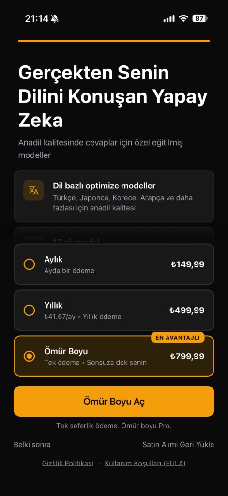
Significant improvements needed for conversion.
Programmatic measurements
Pixel-precise data we extracted before AI critique.
Palette
3 Quick Wins
- Increase the contrast of the CTA button to make it stand out better.
- Add a simple trust signal like '30-day money-back guarantee' under the pricing.
- Enhance the visual separation of pricing tiers with clearer borders or shading.
Issues (8)
- criticaltrust
No trust signals are present on the paywall.
→ Incorporate trust signals such as user testimonials, guarantees, or security logos.
- majorpricing
The pricing information is not clearly visible.
→ Ensure that prices are prominently displayed, possibly in larger or bolder font.
- majorcta
The primary CTA lacks prominence.
→ Increase the size and contrast of the 'Ömür Boyu Aç' button to make it more noticeable.
- majorcopy
The value proposition clarity is weak.
→ Enhance the copy to clearly articulate the unique benefits of the subscription options.
- majorvisual
The visual layout is overly dense with minimal whitespace.
→ Increase whitespace around the pricing and CTAs to improve readability.
- minorhierarchy
Focal point does not lead the user effectively.
→ Adjust visual hierarchy to guide the user's focus toward the pricing and CTA.
- minorcopy
Secondary copy lacks engaging language.
→ Use more persuasive language in the descriptions of the subscription models to entice users.
- minorvisual
Insufficient contrast between top colors.
→ Adjust color palette to ensure sufficient contrast, especially between pricing and background.
Wins
- Aspect ratio matches mobile device format, improving usability.
- Pricing options are clear in tiered format.
- Paywall maintains brand consistency with dark theme.
Competitive take
Without significant enhancements in trust signals and visual hierarchy, conversion rates may remain low compared to more established competitors.